February 24, 2020
We have observed lately, in residential architecture, a preference for a simplified design approach and for the usage of a more limited and natural color palette.Find out why!
This aesthetic of simplicity refers to the philosophical heritage of the modernist movement re-emergence at present, but more deeply, we believe that it corresponds to a desire for coherence and to a visceral need for order and organization in a world which seems to us to have become more and more chaotic.
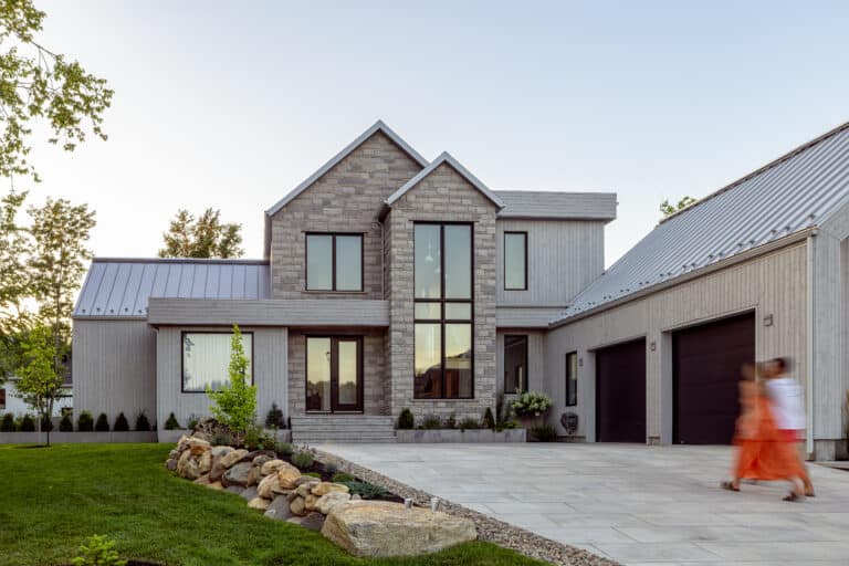
Architects, designers, and design enthusiasts are choosing more and more, for their new constructions of contemporary, modern or transitional type, to opt for sobriety in the composition of the design and in the choice of materials. Born out of a deep desire for serenity, the simplification of spaces and volumes seems to act as a visual antidote to our fast-paced life rhythms. We are therefore witnessing a concerted effort, during the conceptualization of the project, aimed at minimizing contrasts and reducing the number of decorative elements in order to create a cleaner aesthetic.
We see this trend manifesting itself everywhere in commercial and residential construction, both for vacation homes and urban projects. Examples are multiplying, in particular with the impressive popularity of the “modern farmhouse” style on social networks such as Pinterest and Instagram.
How ro succeed in the Implementation of a Design in Sobriety?
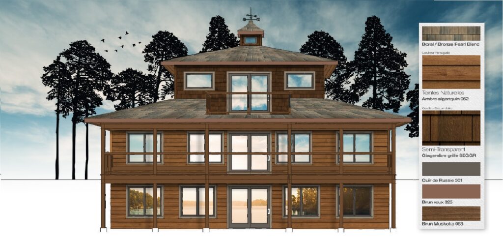
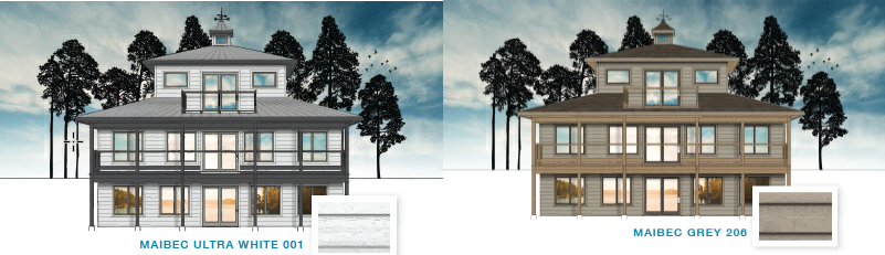
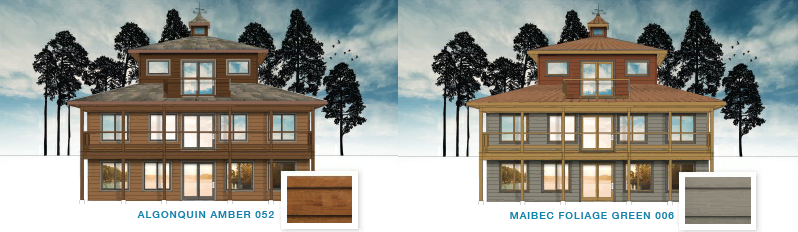
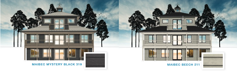
Chosse a palette of neutral tones inspired by nature.
In keeping with the growing trend towards a style of simplicity, neutral and natural tones emerge as the rational choice for the dominant color group in the specification of exterior materials and coatings. Perceived as timeless, neutrals and natural colors are instinctively part of the movement for sustainable and eco conscious design.
Born of a desire to get closer to nature and a concern for environmental protection, this trend will favor the selection of a palette of colors that integrate with its surroundings.
To do this :
In short right now, less is better!
Visitez notre site web pour voir notre charte de couleurs et pour plus d’inspiration!
By Josette Buisson
President and Creative Director Alias Color
www.aliascolor.com